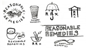
RRx Iconography II
Saturday, December 13th, 2008 | Posted in by Felix
More, more, more from the same project.
1 Comment to RRx Iconography II
out of all the concept dev i like the middle bottom of the page best i think a lot of the logos seam to be too busy and need to be a bit refined. I like the simplicity of the classic RX jar with the twist of the leaf. The text solution on this page isn’t bad either however i feel like you need to do something with the text to make it “theirs” play with the letters a bit more would be my suggestion.
Just my thoughts!
Leave a comment
Search
All we have to decide is what to do with the time that is given to us. – J.R.R. Tolkien
Categories
Recent Posts
Recent Comments
Pages
Felix's Links
Jimerson's Links
Steve's Links
Archives
- July 2015
- February 2015
- August 2013
- February 2013
- January 2013
- November 2012
- September 2012
- May 2012
- January 2012
- September 2011
- August 2011
- July 2011
- June 2011
- May 2011
- April 2011
- March 2011
- February 2011
- January 2011
- December 2010
- November 2010
- October 2010
- July 2010
- June 2010
- May 2010
- April 2010
- March 2010
- February 2010
- January 2010
- December 2009
- August 2009
- July 2009
- June 2009
- May 2009
- April 2009
- March 2009
- February 2009
- January 2009
- December 2008
- November 2008
- October 2008

December 13, 2008